Four months ago, I did something inconceivable.
I sent my first email newsletter.
It’s not the thing I was afraid of, though. Writing those newsletters is rather fun; I enjoy every part of the process. It also feels rewarding to have something finished and sent out to a group exactly every two weeks.
The challenge was finding people to send emails to. Neither my website nor my social media accounts drove enough traffic to find me willing subscribers for an email newsletter—a medium already infamous for privacy-invading, intrusive, spammy marketing. And it would not have made sense to work on weekly newsletters only to send them out to no one, or so few people that the likelihood of anyone reading my emails would be close to zero. I had no intention to half-ass them either; I would rather not have sent emails out at all.
So I did something I could never imagine.
I asked people to subscribe.
It might be the first thing people do when they make something new; but to me, it was scary. I had never asked someone to look at a piece of content—I could barely imagine asking someone to subscribe. My approach was always to leave a post, let people see it, and hope that they happen to be interested.
This time, however, I had to message people directly. I didn’t have a clever marketing scheme where I would offer people something of value for free—which would be free only if they agreed to receive it in an email. To make things trickier, nobody knew exactly what I would send them in the newsletter. I didn’t either. I just had a vague plan to experiment with small bits of hopefully-interesting content, and never be spammy.
To my surprise, it worked. It was simpler than I expected. I only reached out to people I knew could be interested; most were happy to subscribe.
The Plan (I Did Not Have)
Now that the worst was out of my way, it was time to build the newsletter. The fun part.
I had no systems planned out. I didn’t know how this newsletter was going to look. All I had was a general idea of it being not spammy, and a few text-files-worth of ideas.
I knew that I had my social accounts and a website to share updates from. The Refuse website had a huge and recent update at the time, so I had a handful of little details to share from that.
But it’s no better than following a social media account. I wanted the newsletter to carry substantial, but quickly-digestible snippets of content in multiple sections. Something that would be longer than a tweet and shorter than this blog post.
Another thing that was going to keep the emails interesting was the way it would look. Emails support very basic HTML styling, but that still offers a lot of potential from a visual perspective—at least as long as you do things right and work within specifications.
What My Emails Ended Up Looking Like
The first email ended up including these sections, and all future issues followed a very similar plan:
- A tiny note I write to remind readers that an actual person has written the email. It’s easy for newsletters to become too sales-y and focus entirely on products.
- The first email carried a small section explaining optics, which was continued in the next issue. This was an experiment with distributing article content in smaller chunks, across multiple emails. Not all issues of the newsletter have had this.
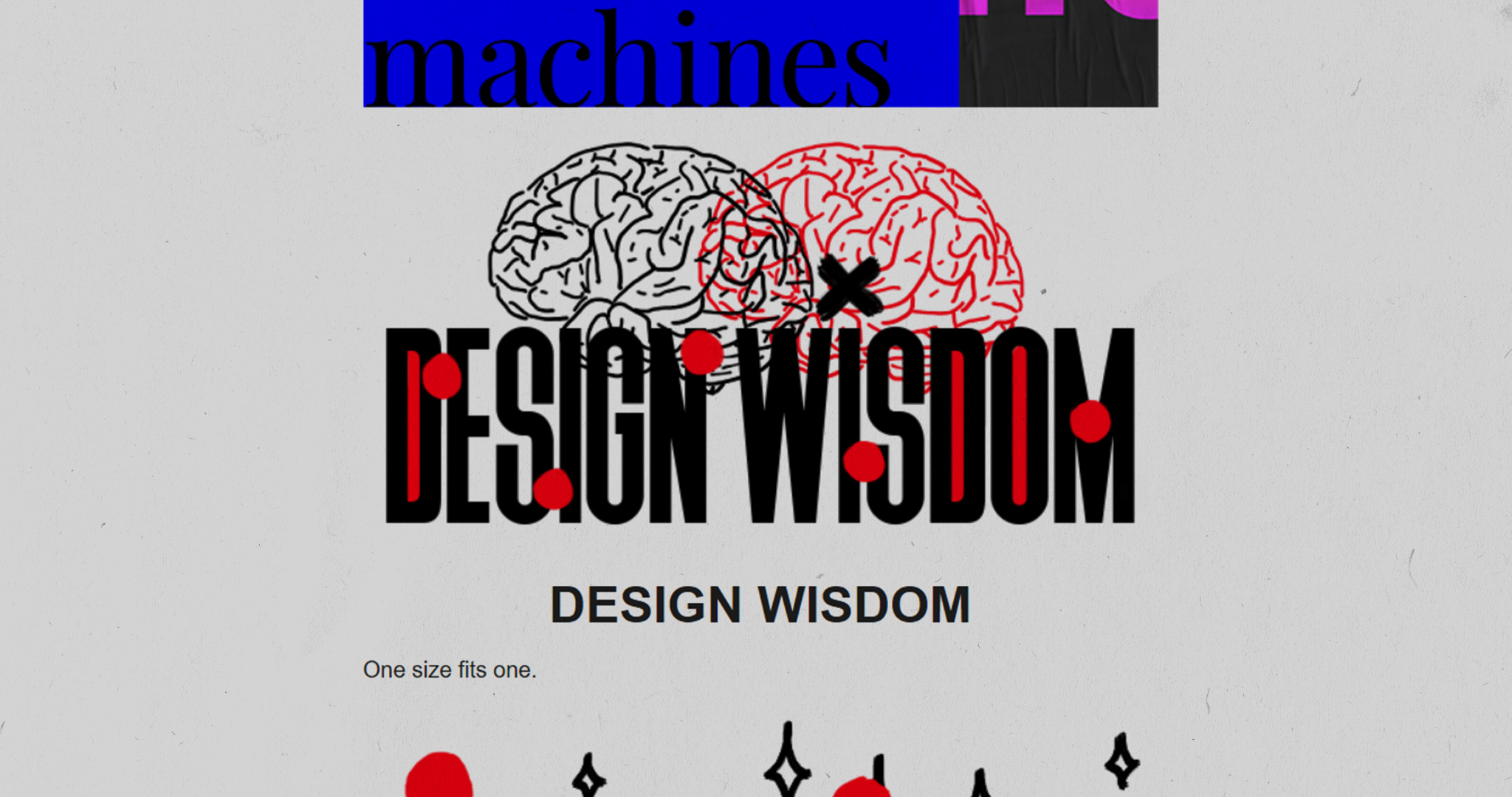
- I’ve had a few reoccurring sections which do not necessarily appear in every email. The earliest issues had design tips and updates from the website, and later issues had (mostly generative) experiments in visual art. Every issue until now has had a section for design wisdom.
- I make sure to draw a small cartoon at the end of every issue. It keeps the newsletter a little more interesting and light-hearted than it would be otherwise.
- I stylize every issue differently. Every single email has newly-drawn titles and a different colour palette from the previous issues. At the time of this article’s publishing, I’ve drawn titles for most issues by hand. It’s mail, after all. Here’s a browser version of issue #9, which has seamlessly-looping, animated titles.
How To Not Screw It Up
One thing I haven’t learned about writing email newsletters is what people prefer to see in their inboxes. At the time of publishing this article, the newsletter has less than 20 subscribers; and not all of them read every single email. I have no reliable data to learn from.
What I have learned though, is a few things that can improve or break emails.
You see, emails are a little similar to the conventional web; though a lot more similar to a text file. Because of its similarities to the web, emails sometimes look and perform very differently across different email clients and devices.
Here’s a small list:
- When possible, be a person. I include a personal note at the beginning of all my newsletter emails to remind my readers that I’m still the one writing to them. Remember that people’s inboxes aren’t ad-machines. Electronic mail is a medium for communication, and was built for people to talk to one another. This remains the primary reason people use it. Nobody signs up for an email account to get marketing content from businesses. Be respectful of this fact, and be grateful to people who care to subscribe to your newsletter.
- Some really popular email clients don’t support web fonts. It’s not a good idea to rely on a typeface hosted online, because many (if not most) recipients will see a different typeface. Make sure your emails look at least nearly as good with the fallback typeface as they do with the web-hosted font.
- Don’t use images to display text. Your email could be marked as spam. This is not a strict condition; but a high enough image-to-text ratio can alert email clients. Scammers sometimes try to hide phrases from spam filters by displaying them in images, which is why email services can mark your image-heavy emails as spam.
- Don’t rely on images to communicate with your readers. This is an accessibility issue for obvious reasons (some people use screen readers). But assuming you’re an a-hole who doesn’t care about accessibility anyway; email clients sometimes don’t show images to your recipients. It’s always nice to add alt text to images for when they don’t show up. As a small, extra step; I always add a copy of my drawn headings under them, but in plain text.
- Emails are text messages and you should treat them as such. This means that one of your primary goals should be to make sure that your emails render as quickly as possible. Always optimize your images to reduce their file size, and stick to reliable image formats. Most (of the popular) email clients don’t support embedded videos, so stick to GIF images for animations. When doing this, optimize your GIF images to minimize file size and maximize compatibility. A long render time does not make sense for emails.
- Make it easy for people to unsubscribe from receiving your emails. This is the right thing to do; but I will once again assume that you, the reader of this blog post, are an a-hole who doesn’t care about ethics, user experience, or being nice to people who are generous enough to agree to receive your emails. If my shaming hasn’t convinced you; many countries have anti-spam laws which require you to include a clear way for people to unsubscribe from receiving your emails in the future.
- Don’t fight for attention. In a world where people are conditioned to ignore attention-grabbing and sales-y phrases, it’s a really bad idea to make your emails look like every other piece of scammy garbage rotting in your inbox. Keep the subject line short, sweet, and accurate. People are tired of reading subject lines about yet another exciting thing; with the promise of being more exciting than every other email about an exciting thing in your inbox. I title my newsletters the following way: [An emoji] The Refuse Newsletter #[a number for the issue]. This subject line helps people understand what’s in the email, and who it’s from.
- This is an obvious one, but always send emails like these with consent from your recipients. You may want to go through privacy laws before you start misusing other people’s data for email marketing. Even if you don’t get into legal trouble, sending spam emails gets you moved to the—you guessed it right—spam folder.
