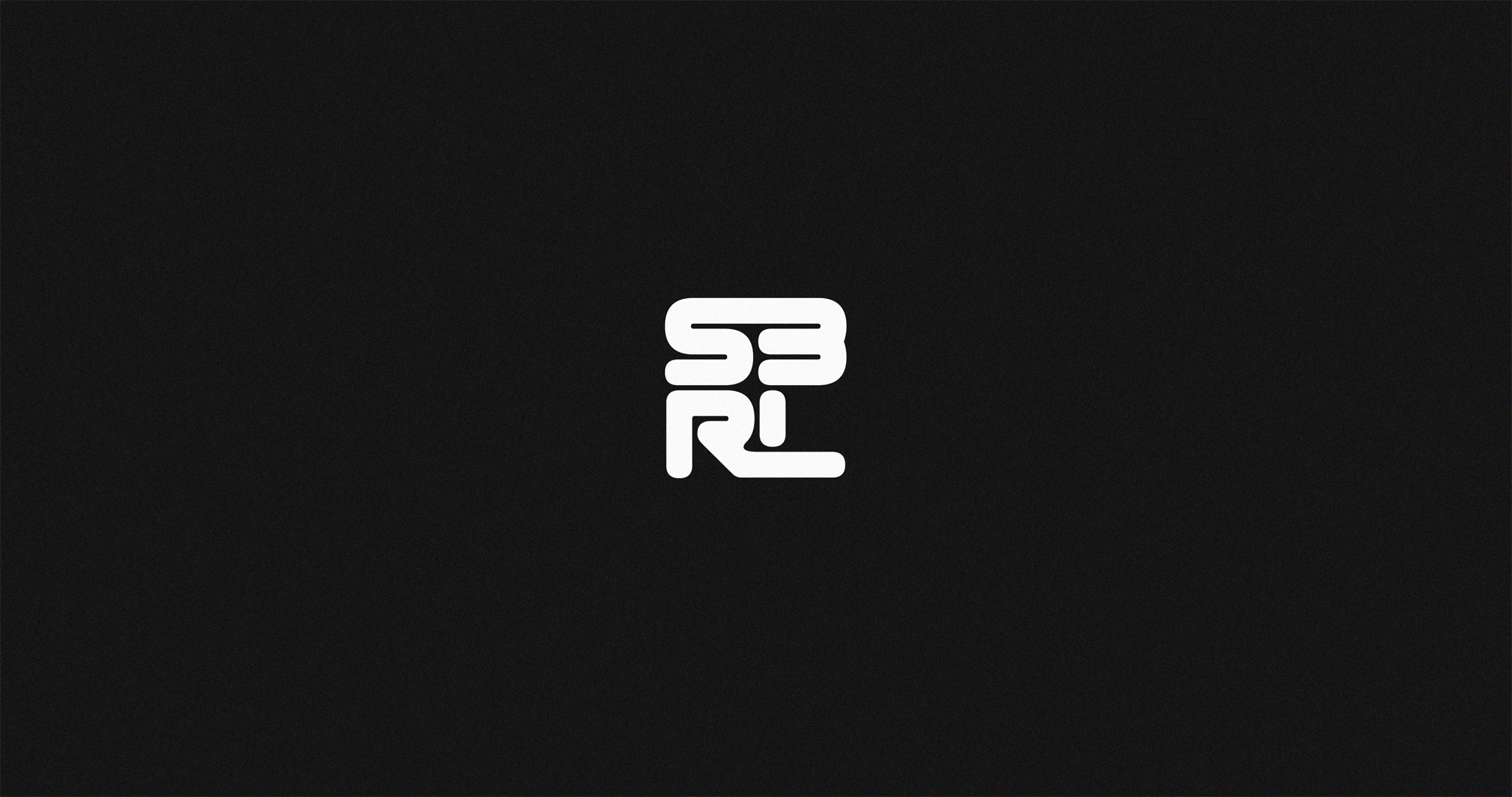
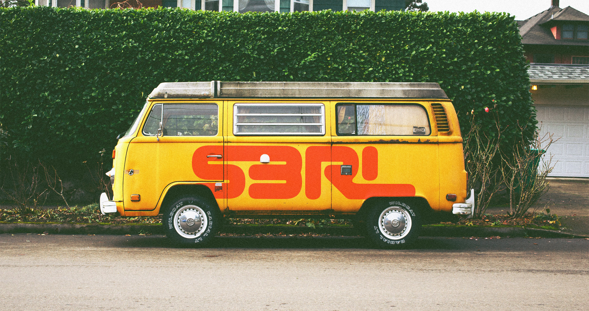
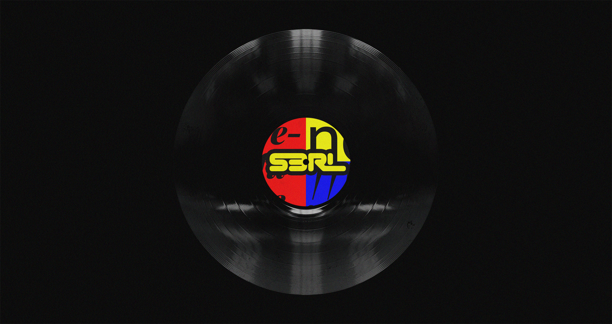
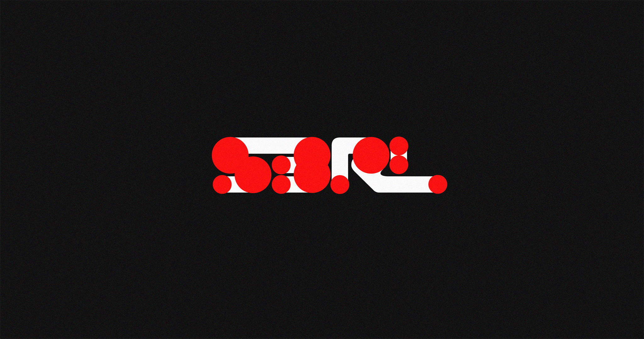
We worked with the legendary happy hardcore producer and DJ, S3RL, on redesigning his logotype.
The Goal
We had to redesign DJ S3RL’s logotype without compromising the familiarity and meaning it had developed through the span of his career.
Our Approach
We knew that the original logotype Jole Hughes (DJ S3RL) had created years ago was distinct, recognized by everyone, and really strong on its own.
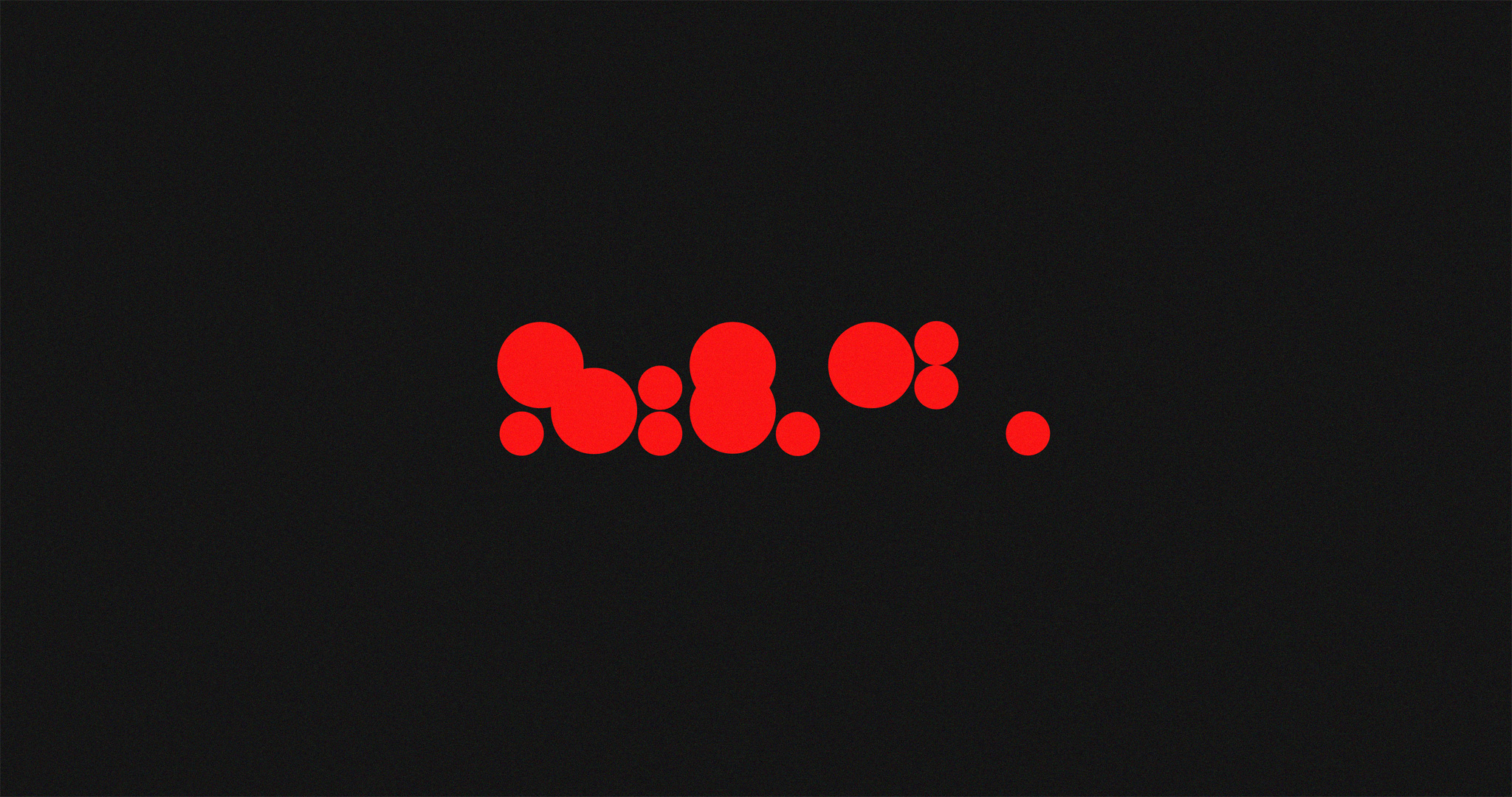
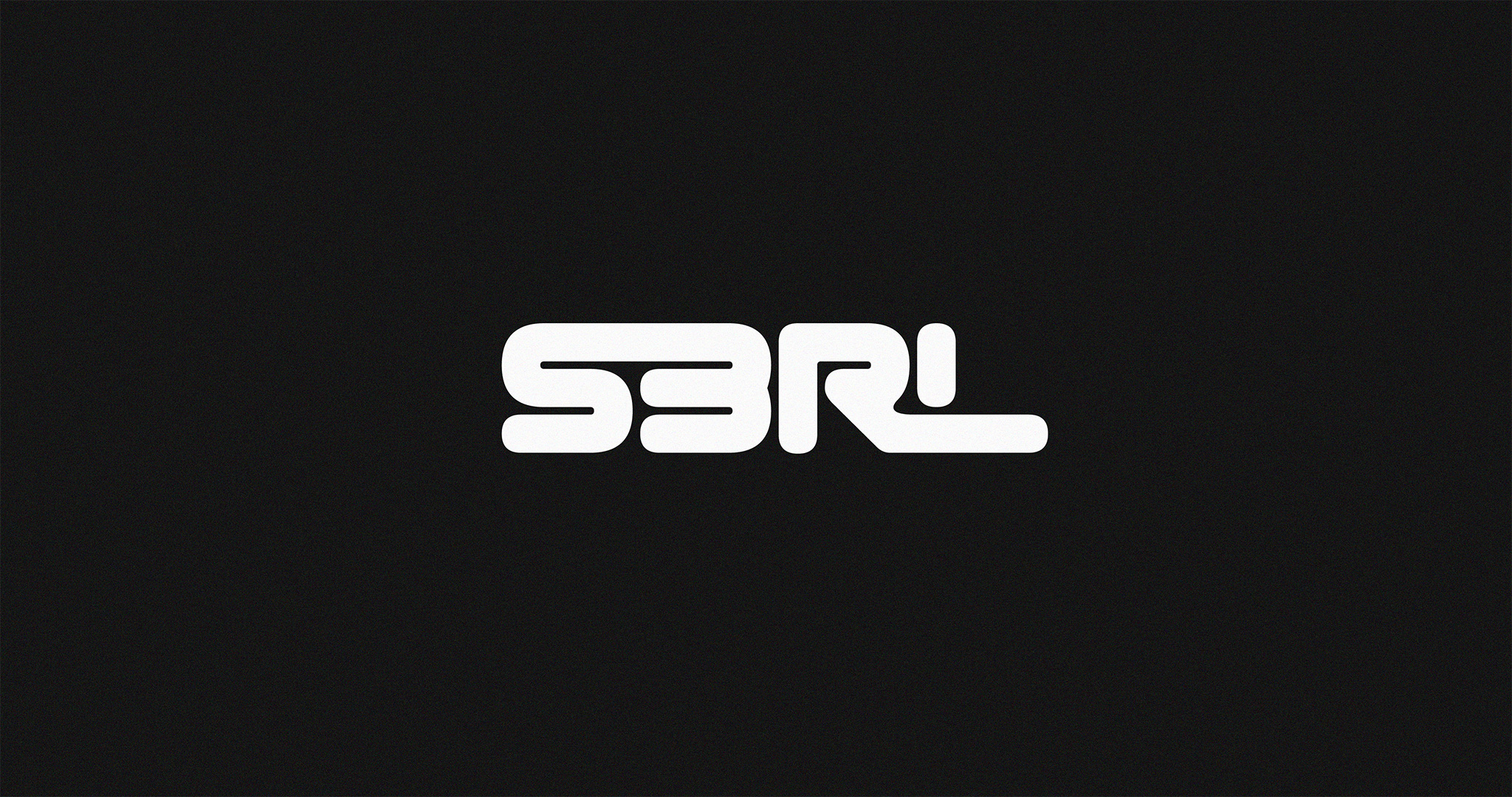
So we changed nothing. We still had the original design, now laid out on a clean grid and adjusted into a legible, balanced, and versatile piece of creative typography.
A Secondary Mark
S3RL’s logo was a beauty on its own. But due to its rectangular shape, it looked much smaller in non-horizontal spaces than it needed to.
So we came up with a solution: distributing the type into two lines.
The result was square, balanced, a little less fun, but a lot more adaptive.
