M4 Music Logo

Identity Design

S3RL, a happy-hardcore producer and DJ whom we have worked with before, often has other artists remix his music.

These remixes have been, for a long time, released through EMFA Music—S3RL’s own label. He wanted to release all new remixes of his music through a new, separate label, which was going to be called M4 Music.

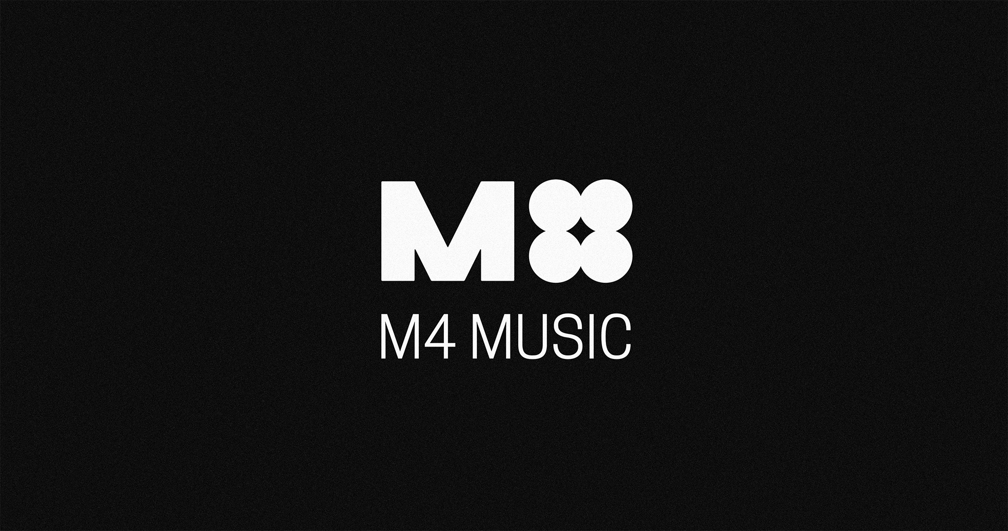
And M4 Music needed a logo. A mark. A symbol. A sign. A logotype.

But just a logo; because M4 Music was going to only function as a secondary label for releasing remixes.

The first step was obvious:

Sketches

3D render of logotype prototypes produced on a grid, overlayed by shattered glass refracting the image.
3D render of logotype prototypes produced on a grid, overlayed by warped glass refracting the image.

As the next step, I proceeded to obliterate as many of my sketched-out ideas as I could:

Logo prototypes sketched out on a grid, with design flaws overwritten in red marker.

The Magic Number

In the end, I had not one,
not two,
not five,


but three logos.

Why three? Because, two can seem too few, and four is definitely too many.

Just kidding. There’s no actual ‘magic’ or optimal number for this. Three options are often a safe choice because it’s a manageable number that isn’t large enough to demand excessive design-labor. Fewer options (even just one) work just fine, if not better (assuming that your client isn’t judging the value of your work by the amount of labor or output you give them).

An abstract, symbol-based logomark featuring a one-and-a-half-cycle segment of a sine wave, and an abstract digit ‘4’; laid over a magenta-yellow duotone background.
An industrial, symbol-based logo featuring a mechanical-feeling uppercase ‘M’, and four circles joined together to represent the number ‘four’; laid over a photograph featuring two people standing in an alleyway.
A symbol-based logo featuring a wide, industrial, uppercase ‘M’, with four circles joining together to represent the number ‘4’; laid over a green-and-lime duotone photograph background.
An abstract, symbol-based logomark featuring a one-and-a-half-cycle segment of a sine wave, and an abstract digit ‘4’; laid over a grayscale photograph featuring shelves of vintage electronics and screens.

The Final Logotype

The M4 Music logotype. It features a bold, industrial, uppercase ‘M’, and 4 circles grouped together to represent the number ‘four’. White logotype over black background.
A photographic mockup of a stylized, chrome render of the M4 logotype printed on a compact disc (CD), inside a CD case.
A 3D render of the M4 logotype in a weathered, golden, metallic material, embedded in shiny, frozen lava rock.
The M4 Music logotype. It features a bold, industrial, uppercase ‘M’, and 4 circles grouped together to represent the number ‘four’. Black logotype over white background.
3D render of the ‘M4 icon’, in a white, mineral-like material, enclosed in a transparent glass orb.
3D render of the ‘M4 icon’ as a black, two-dimensional plate, seen through a screen of cracked, refractive glass.
The M4 Music logotype. It features a bold, industrial, uppercase ‘M’, and 4 circles grouped together to represent the number ‘four’; accompanied by text reading ‘M4 MUSIC’ underneath in all-caps. White logotype over black background.
A photographic mockup of the M4 Music logotype, as part of illustrative print graphics on a vintage-style t-shirt.
3D render of the M4 Music logotype in scratched and weathered, pink-colored plastic material.
More projects like this.

Contact:


[email protected]
instagram.com/refuseink
m.me/refuse.ink

Subscribe to our email newsletter:

* indicates required