S3RL and I had finished up with our back-and-forth discovery sessions and had the final strategy document ready. All important questions had been asked, and all necessary conclusions drawn. It was time for us to start setting a direction for branding.
The strategy we had collaborated on before this, was an extremely important first-half of the entire branding process. Learn what we did and how we did it by clicking this link, if you haven’t already.
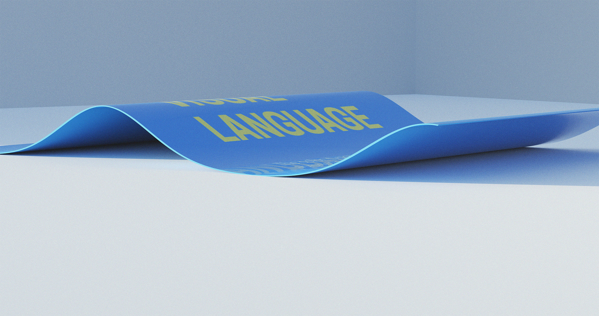
Picking a Direction
Before I could start creating, I needed to know where to begin and where to take it. And even though the strategy document told me a lot about S3RL, his audience, and his inspirations; I still needed to know where the man himself wanted his brand to go. I had to strike a balance between what he wanted and what he needed.
If only there were a way for me to get his feedback before I could start designing—
There is.
And it’s called ‘mood-boarding’, as us creative professionals have decided to call it. As the name suggests, it involves creating boards that communicate mood—visual mood, specifically. It’s like making collages, except that your goal is to stay legible and consistent, and successfully represent a visual style or ‘mood’.
The moodboards I created for S3RL started out as a single Pinterest board, informed by the strategy we had produced earlier. Images from this board were then grouped together and refined further into even more Pinterest boards, which were more consistent and represented different moods—all of which fit S3RL’s brand in different ways.
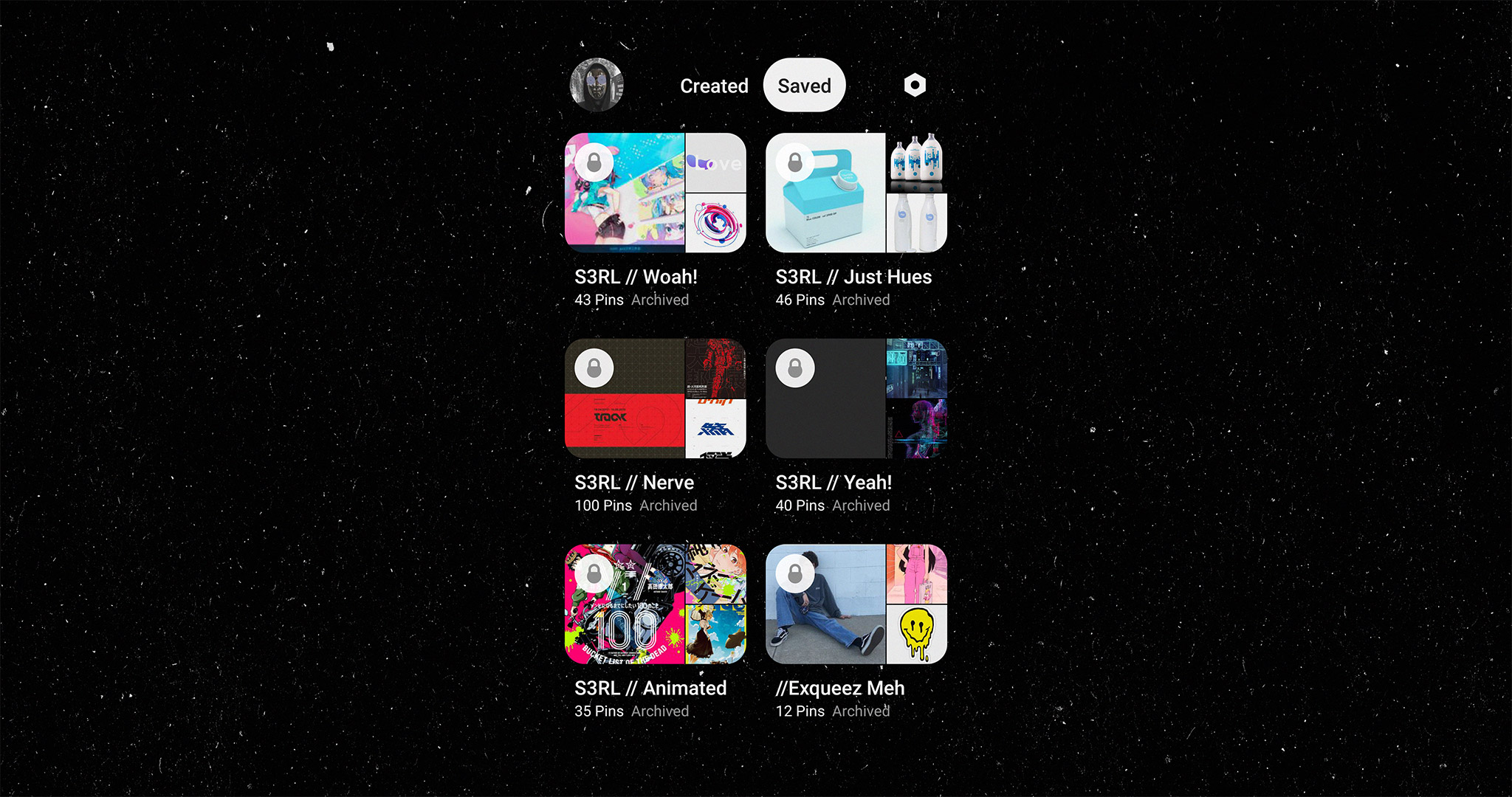
I produced 10 arbitrarily-named moodboards from these already-arbitrarily-named Pinterest boards; then ranked them multiple times according to each part of the strategy document.
The initial plan was to come up with as few moodboards as possible. Ideally two; maybe a maximum of three.
We ended up with four.
Because even though only three of those ten moodboards survived my somewhat-organized-ranking tests, I decided to include a fourth board because I felt that S3RL might have a reaction to it (spoiler: he didn’t).
Picking a Direction: Picking a Direction
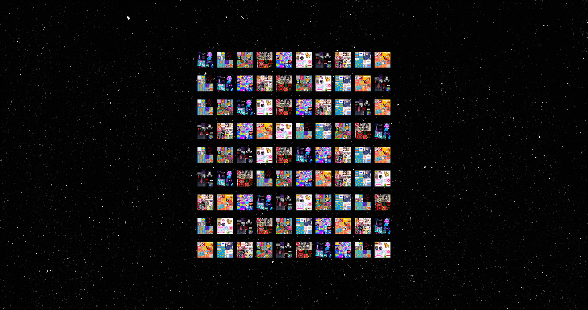
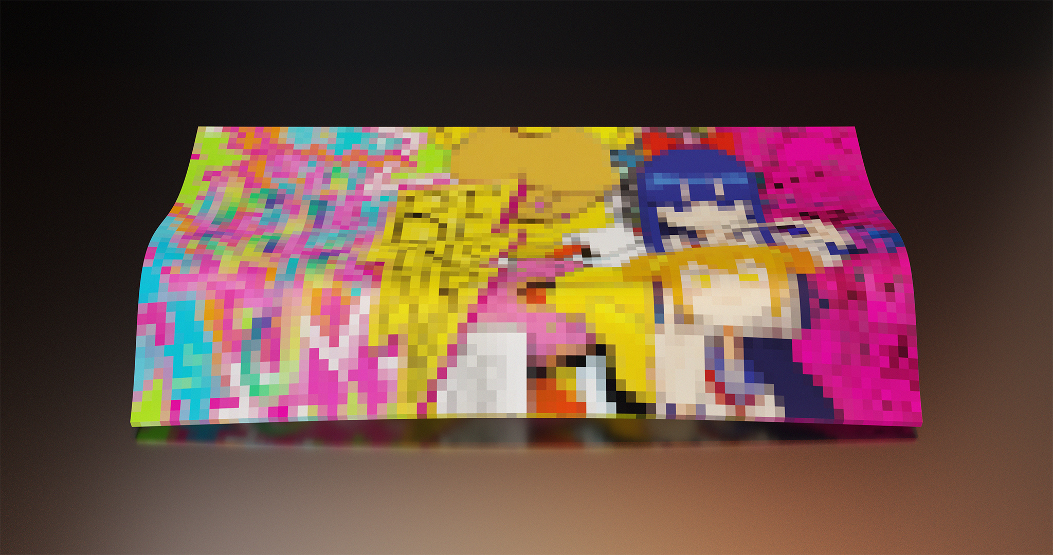
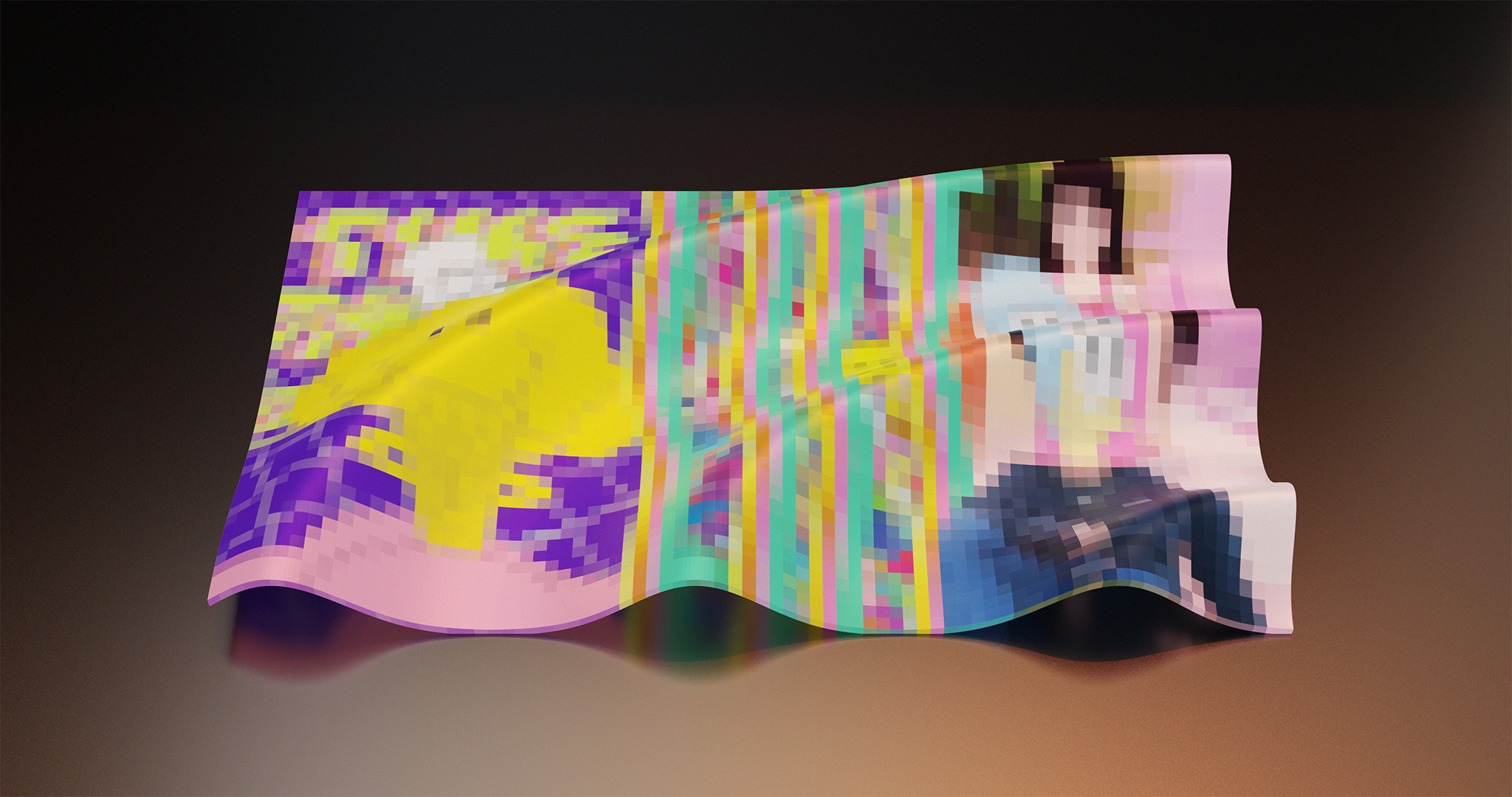
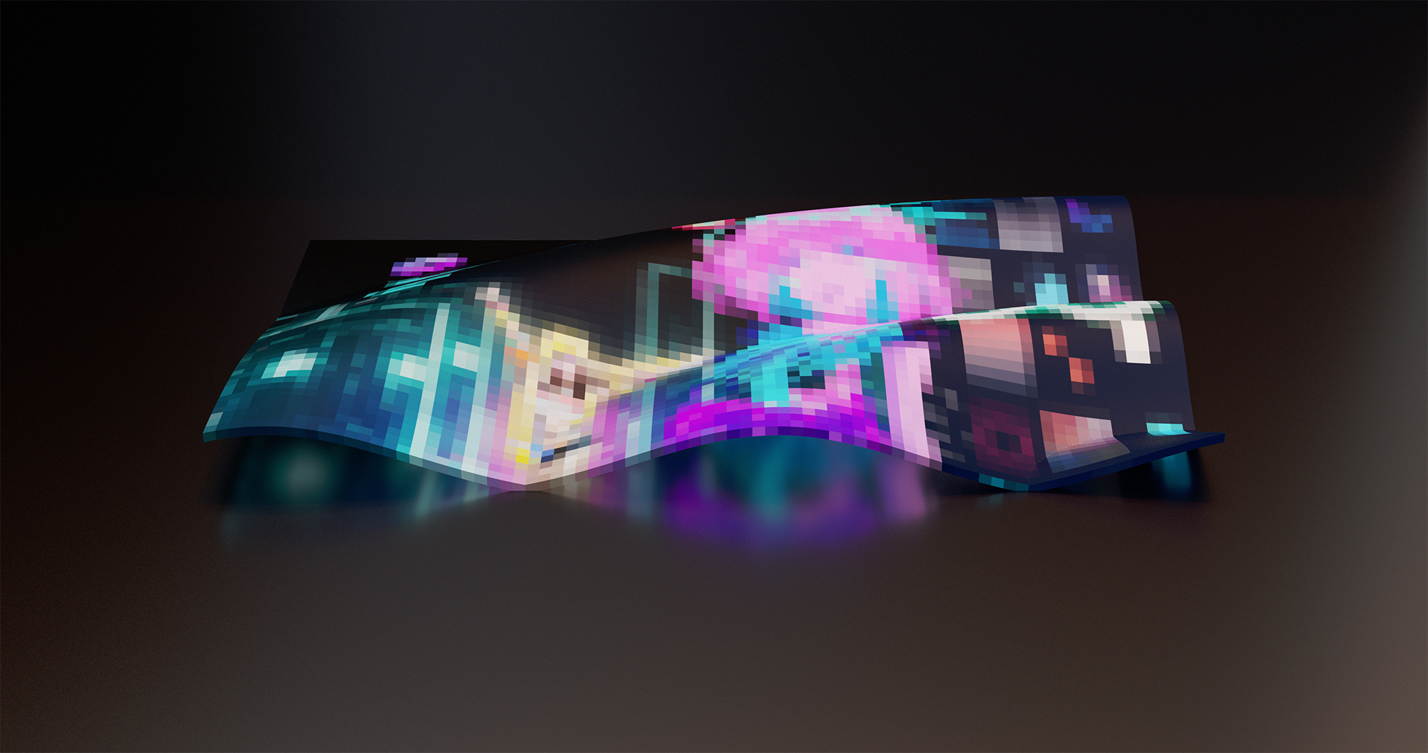
Once I had refined all four moodboards—all made up of amazing images I did not own or have the rights to (also why you’ll only get to see these heavily-pixelated versions of the original moodboards)—I sent them to S3RL for review.
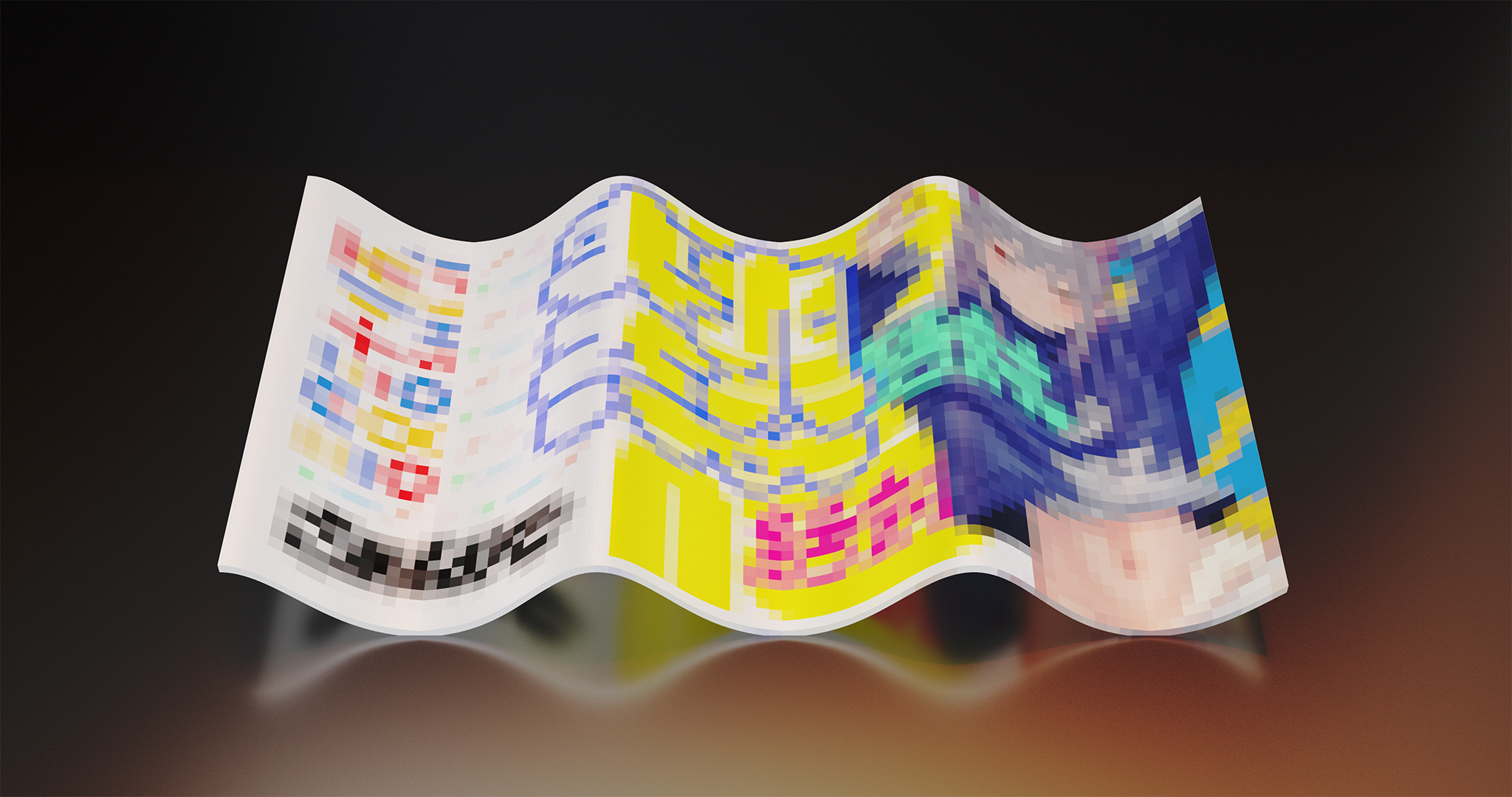
This was the moodboard he picked:
Jole and I both agreed that this visual style represented who he was at the time; and that it was certainly the direction he was heading as an artist.
Now that we had established a direction, it was time for me to start working on the brandbook.
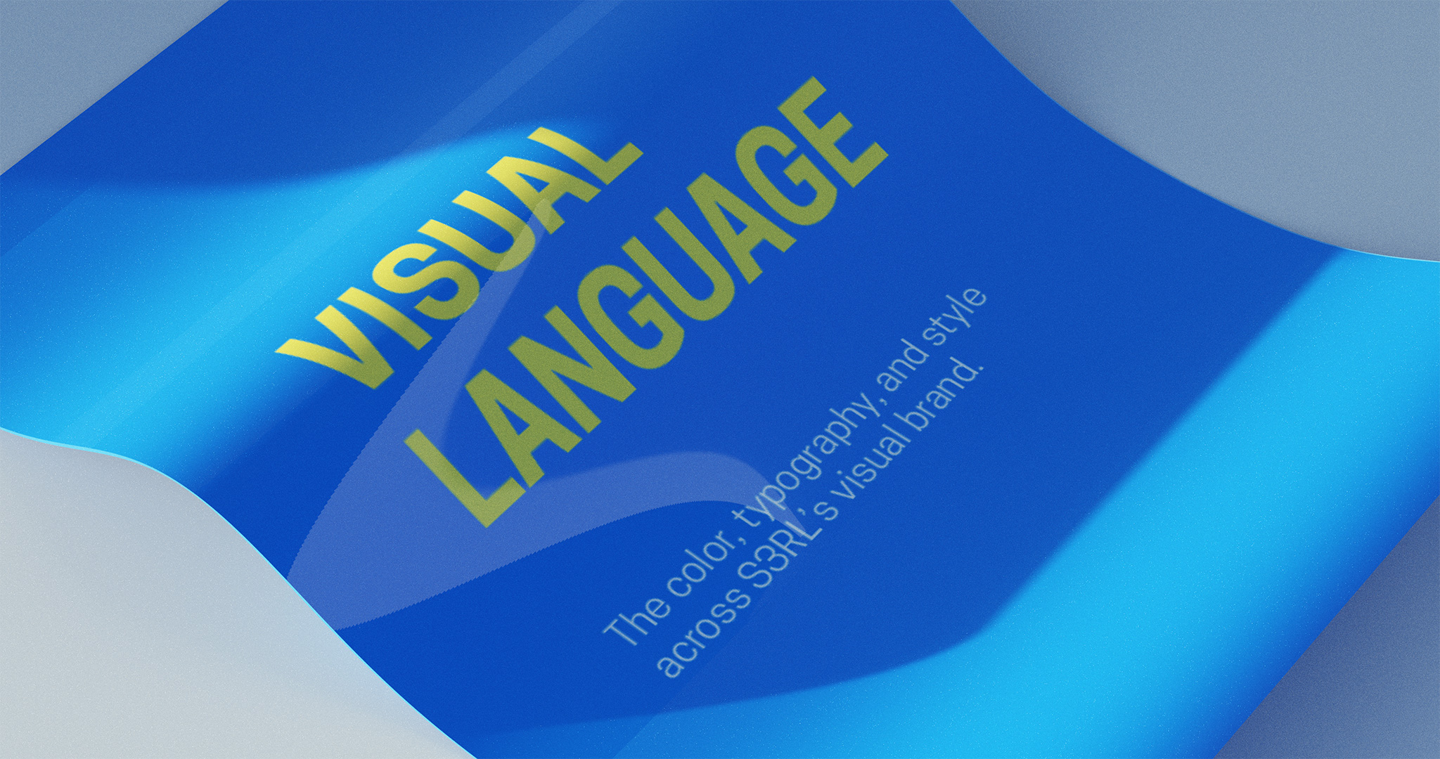
Typography
Everyone deserves great type; and so does S3RL. As the next step in this process, I started looking for the perfect set of typefaces (fonts).
Thanks to the strategy we had produced earlier, I knew what I was looking for: a moderately tall, modern, sans-serif that would work well in paragraphs. Something like Roboto, as good as Roboto, but not Roboto(fun fact: you’re reading this article in Roboto).
I decided to keep readability a primary focus, which may not immediately make sense when you’re branding for a DJ/producer whose superpower lies in expression. However, I wasn’t looking for fonts that would work with just cover art or videos; because S3RL does as many things with his visuals as he does with his music (a lot). S3RL was one of the few creators this applied to, and no set of typefaces could cover that (without complicating things—this branding project was intended to be relatively simple).
We needed a type family that would work everywhere else: on the website, in print, and anywhere else that wasn’t already stylized. Something as good as Roboto, but more fun.
After testing dozens of typeface combinations, I picked a small and truly remarkable type family with three weights. The type family was called Cooper Hewitt, and was designed by Chester Jenkins—commissioned by Pentagram for Cooper Hewitt (the Smithsonian design museum).
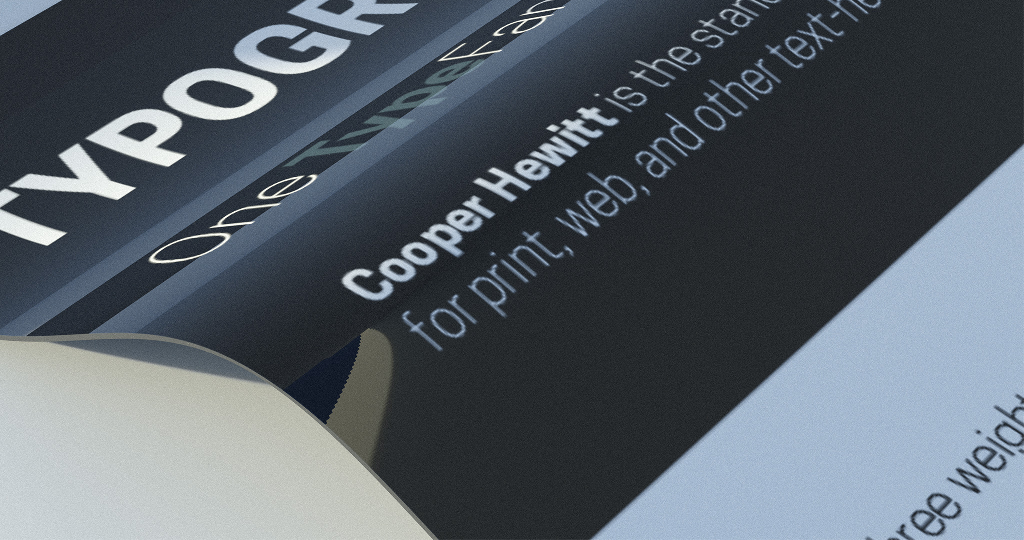
It was the perfect typeface for S3RL. Extremely readable, but also surprisingly expressive. It did everything I needed it to do.
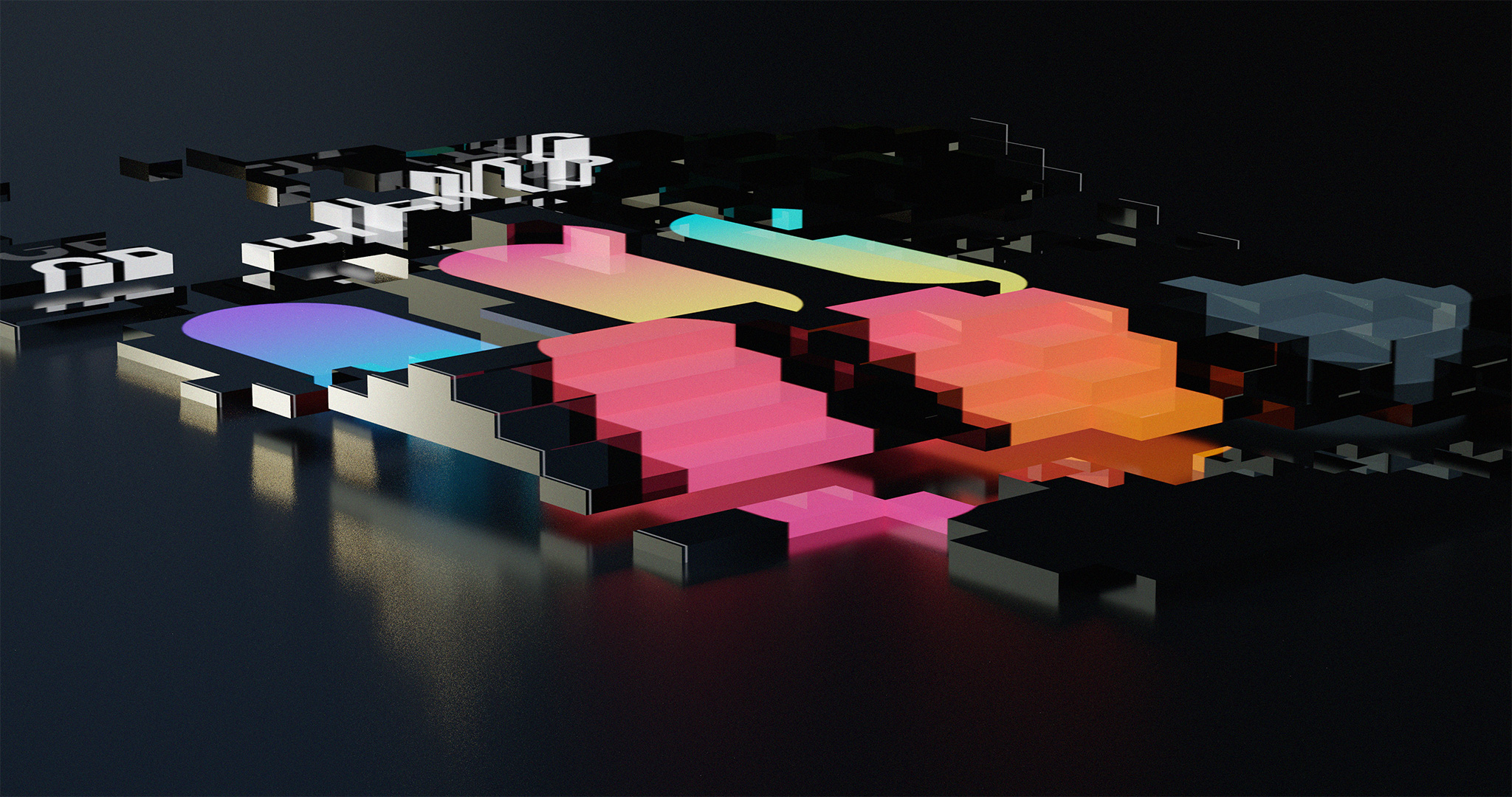
Color
The visual side of S3RL’s brand has always been really colorful (and I mean REALLY colorful). And that makes his cover art and music videos as interesting as his music. We wanted to reflect that while retaining functionality.
I thought I had the solution: a massive palette with every color an artist working on S3RL’s brand might need. But I realized why that wouldn’t work, almost as soon as I started.
There were a few problems with this idea:
- Jole loves to work with animators and motion designers, and allows them creative freedom while working on his videos; without too much direction. This helps them do things the way they do them best, and come up with high quality videos that people want to watch. Having them use a palette could complicate their workflow, and possibly stop them from doing their best work.
- Every new track that S3RL releases, explores something different than the last one. What doesn’t change, though, is that it remains extremely expressive; way more than what you’d hear from most artists. Any regular-sized palette I’d make him would be somewhat cohesive, which wouldn’t do the diversity in his discography justice at all.
- S3RL has always been laid-back and fearless with his approach towards making and commissioning art. That’s just who S3RL is. We wanted the color palette to represent S3RL; not modify him.
- Assuming we could have a massive palette that would cover everything and still be usable, we’d still have to optimize it for different media. And to do that for a large palette with saturated colors, would be a disproportionately large amount of work for the project and what we had intended to achieve with it.
- Having physical media like print, wearable merchandise, or accessories conform to brand colors would complicate production and sales for Jole, and force him to price his physical merchandise higher.
I decided to not interfere with artwork or physical media too much. While I still made sure that the brandbook did guide those things (more about that below), I decided to limit the palette to a few key colors, that were optimized for modern screen displays.
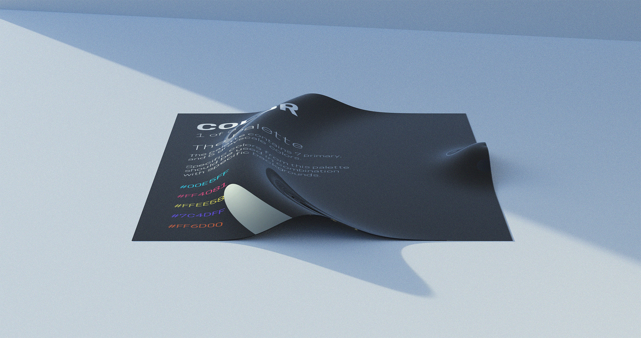
And because I had picked these colors from Google’s Material Design color palette, S3RL or his collaborators could always pick more colors from the publicly-available palette when they would need to.
Creative Freedom
The deeper we dug into S3RL as a brand, the more we realized how important it was for S3RL—and people he collaborated with—to express themselves. I made sure that the brandbook would communicate this.
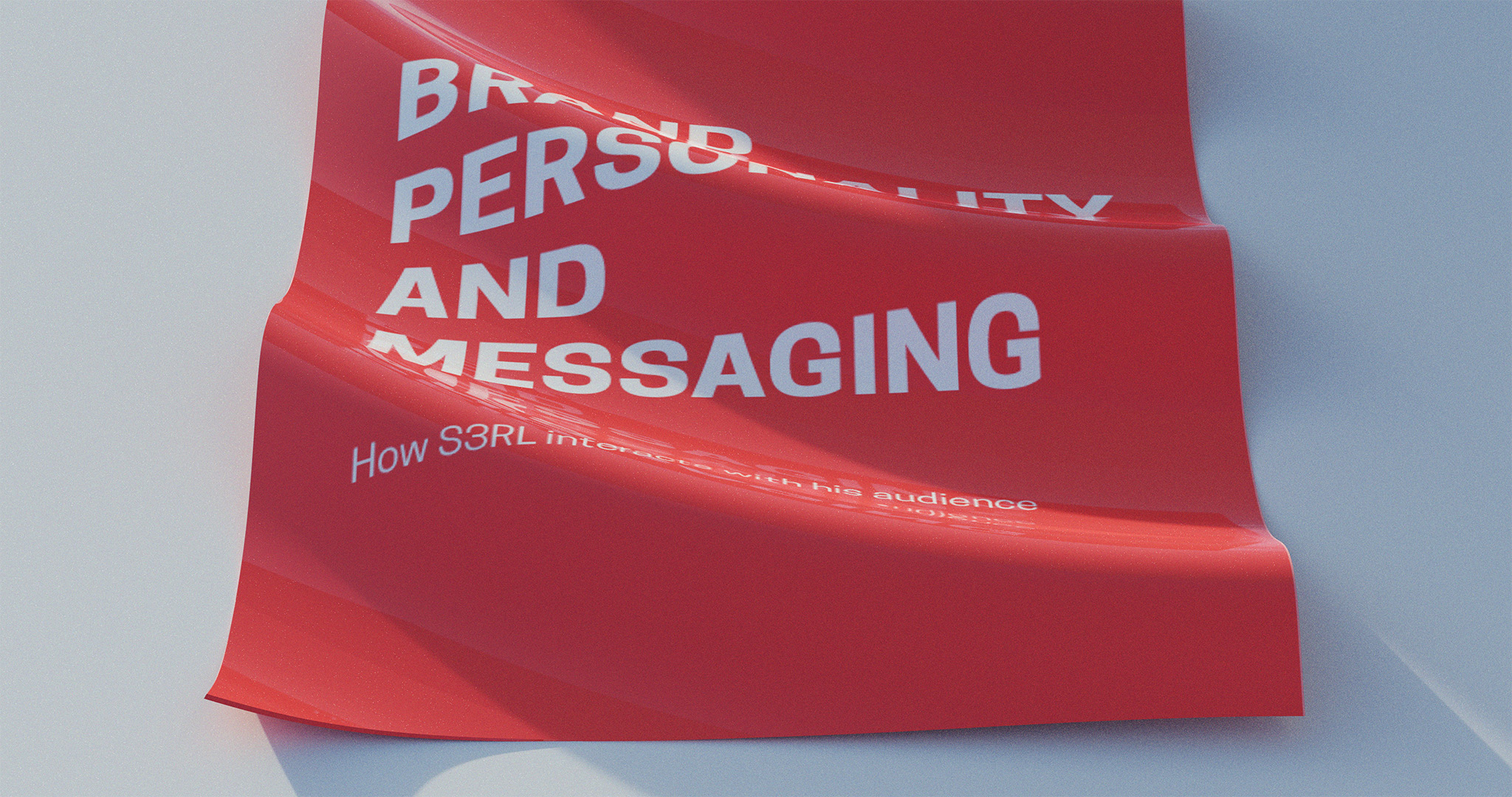
Brand Messaging
Jole had always interacted with his audience in a particular way. He had always been fun, laid-back, and welcoming; and his fans knew that. We wanted to make sure that anyone who worked with or for S3RL, would know how to represent his personality when creating content for him, or interacting with his audience.
The Brand Personality and Messaging section of S3RL’s brandbook was informed directly by the strategy document, as it didn’t need to be translated into a different medium like the rest of the brandbook(which was translated into visual guidelines).
More projects like this.