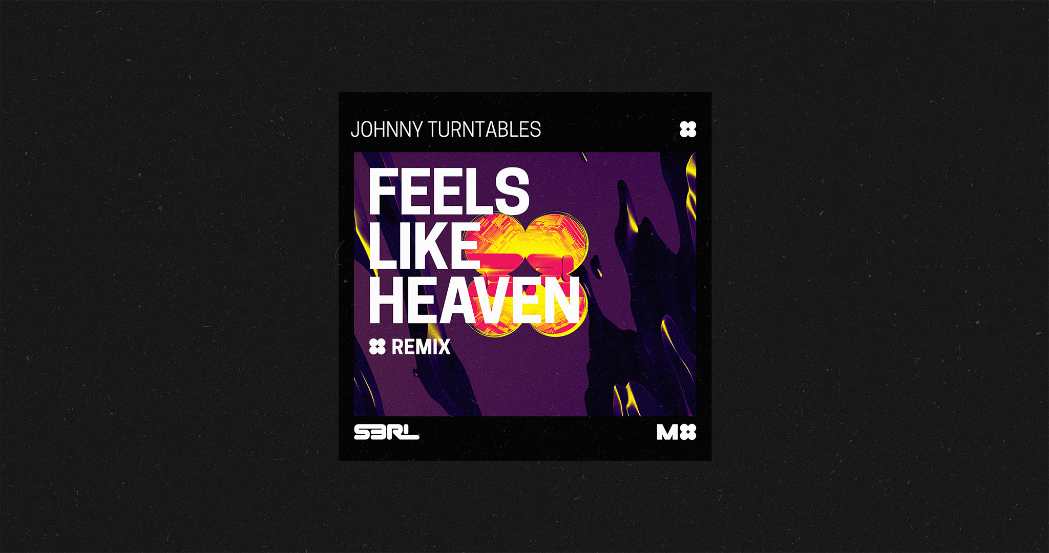
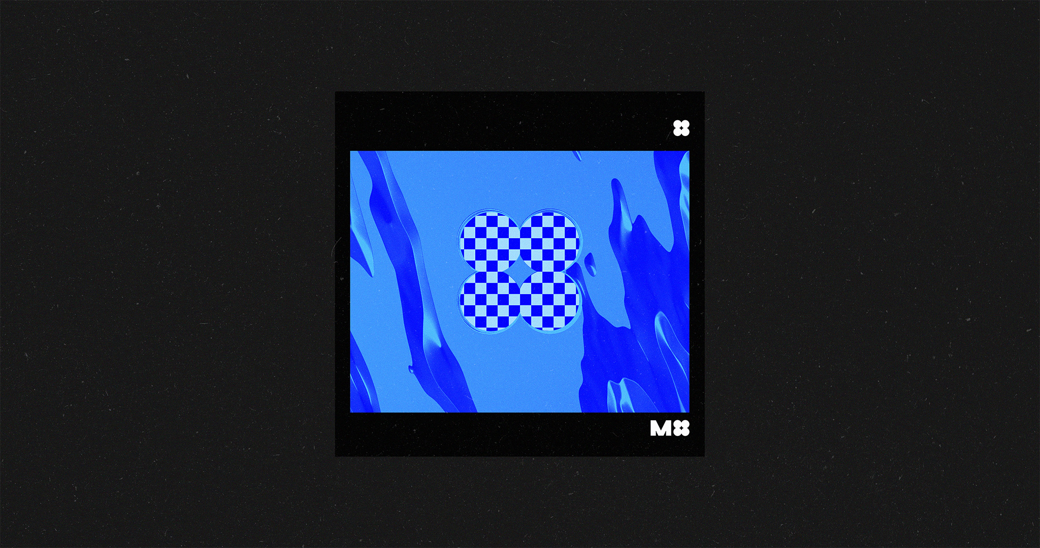
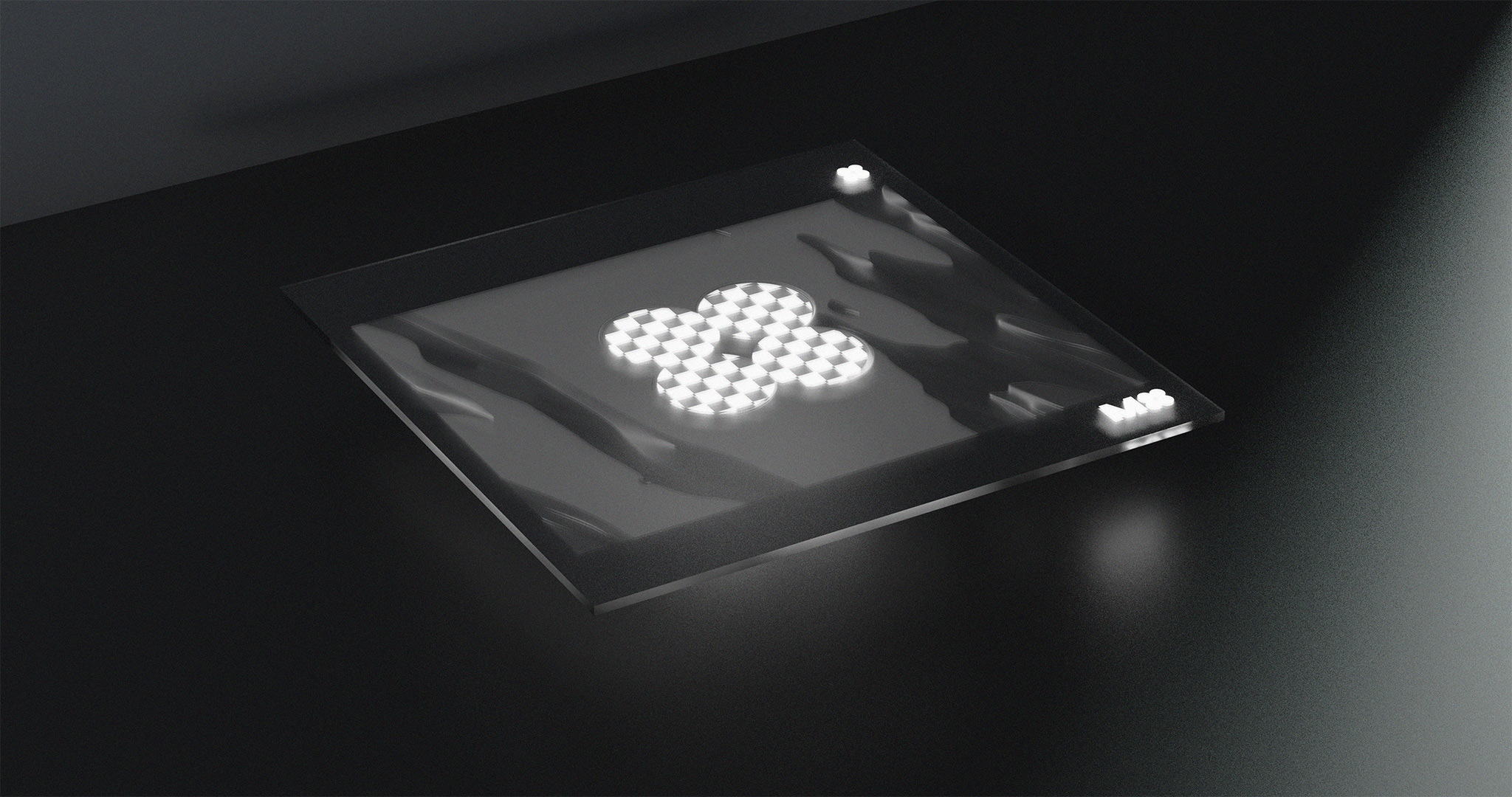
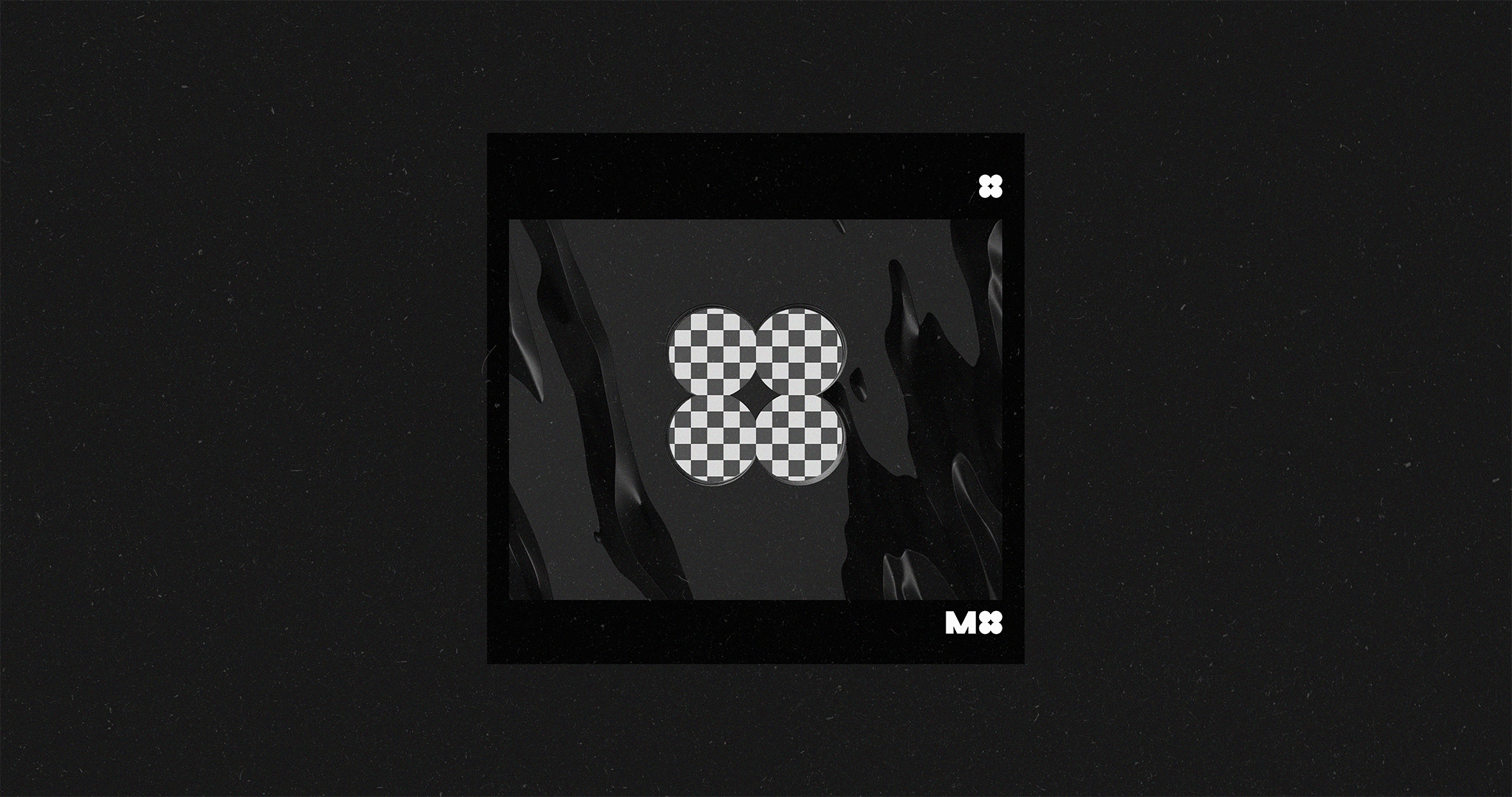
Now that we had finished working on the logo for M4 Music, Jole (S3RL) needed something that would help him maintain quality and consistency in cover art, when releasing remixes of his songs through his new label.
He wanted a template that would always look good, would be easy to edit-and-export images with, and would still represent each track uniquely. Something that would be high quality, but low effort.
After bouncing a few ideas back and forth, and figuring out what each of those would mean for the project (and eventually for usability); we decided to go with the simplest, the safest, and the most familiar solution: a multi-layered image template, that would be editable through a ‘popular image-editing software application’😉.
The first step was moodb-
Moodboarding
Unlike the name suggests, mood-boarding isn’t some strange sport that involves emotion. It’s just a fancy word that us visual artists use to describe the process of creating collages or collections of/from images; which then represent visual styles, or ‘mood’. ‘Moodboards’ help us define and communicate visual styles before starting work on the actual stuff. This helps us explore visual styles and directions faster; and save up on time, energy, and budget.
Moodboards that I created for this project started out as a single Pinterest board, which went through two stages of refinement.
Once Jole and I had gone back and forth on discussions about the moodboards and landed on a visual style, it was time for me to start working on the first batch of prototypes.
Typography, & The First Round of Prototyping
Thanks to the moodboards, the first batch of prototypes was consistent in style and composition; which gave me more space to fine-tune the typography, explore content, and optimize editability.
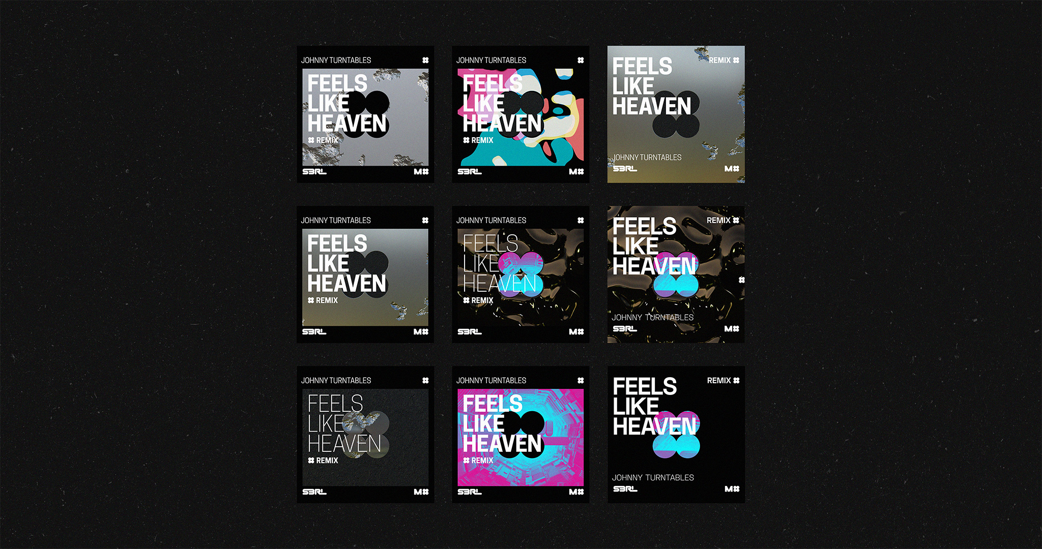
After testing multiple typefaces in this batch of prototypes, the type family I ended up using was Cooper Hewitt—the same family I had also used in the branding of DJ S3RL (see the project here). And it made sense; Cooper Hewitt just worked better than every other high quality font I had tested. This type family was created by Chester Jenkins, and commissioned by Pentagram for Cooper Hewitt (the Smithsonian design museum); and it is as beautiful as it is legible. Read more about Cooper Hewitt (the type family) here, on Cooper Hewitt’s (the museum’s) website.
The Second Round of Prototyping
I narrowed my options down to a few prototypes, and proceeded to test how each of these could be made editable.
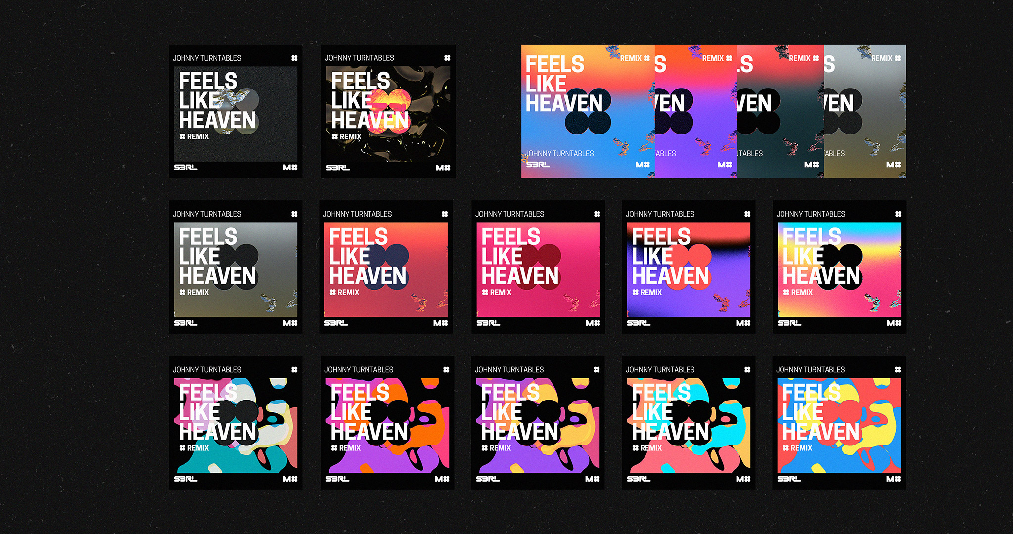
These prototypes used gradient-mapping within a ‘popular image editing software’ (😉)—a feature which maps gradients of chosen colors to images underneath, based on value (or darkness; or lightness).
I sent this batch of prototypes to S3RL for feedback. He liked that one of these demos featured the original cover artwork—which, consequently, became a feature that I kept and moved forward with.
The Final Round of Prototyping
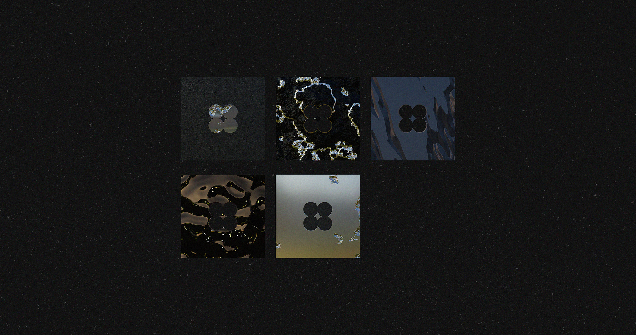
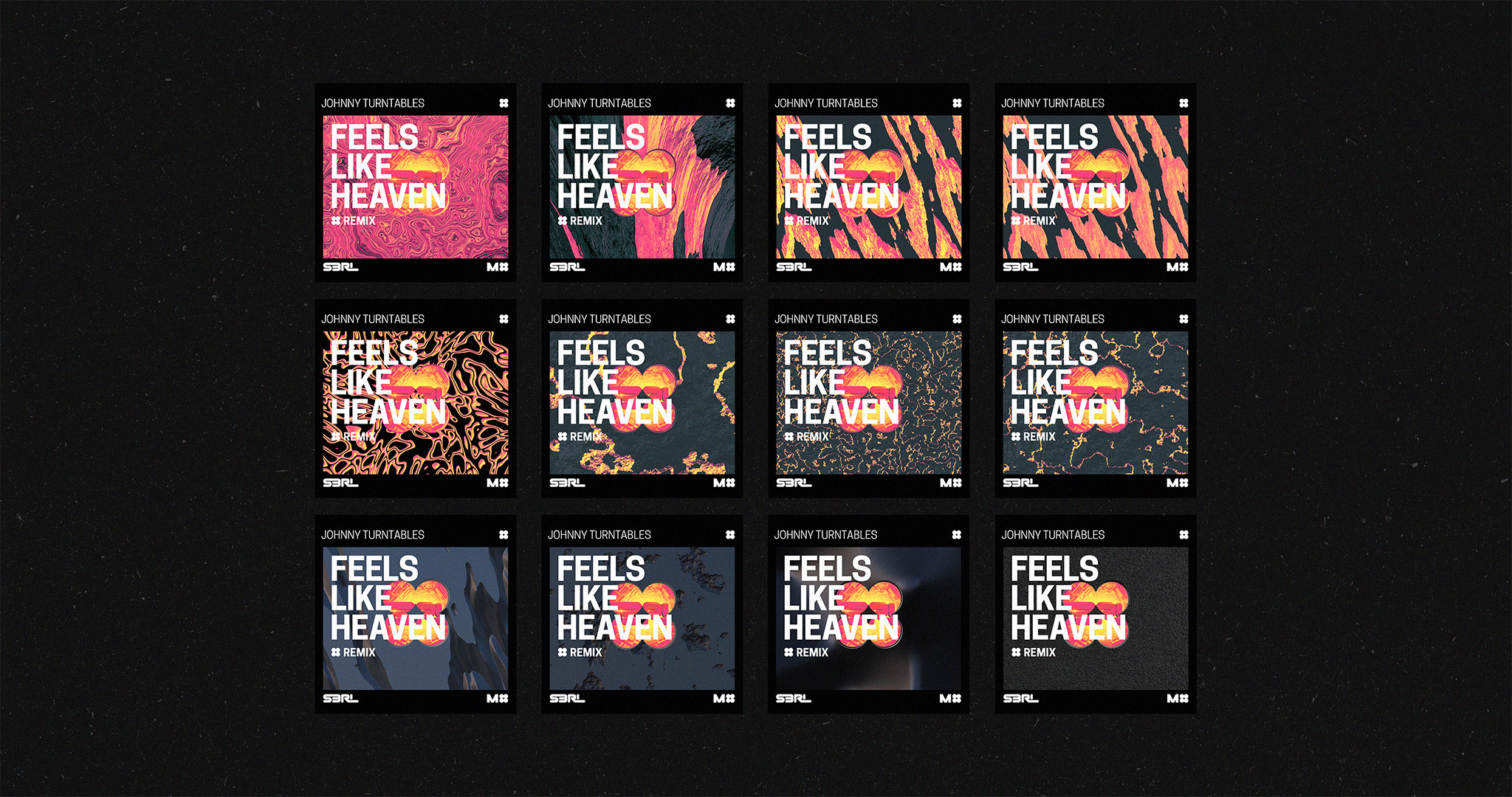
By this point, we had something concrete to explore around and refine. I experimented with how different renders affected style and type legibility, and how they behaved when edited with gradient maps and other adjustment layers.
Refining the Final Artwork & Making it Editable
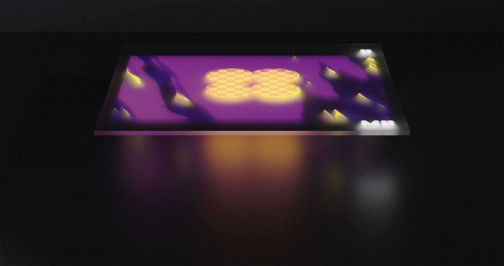
After I worked with S3RL to sort through the final batch of prototypes, and arrive on the final design; I made some final quality adjustments, and added another color-editable layer to the template.
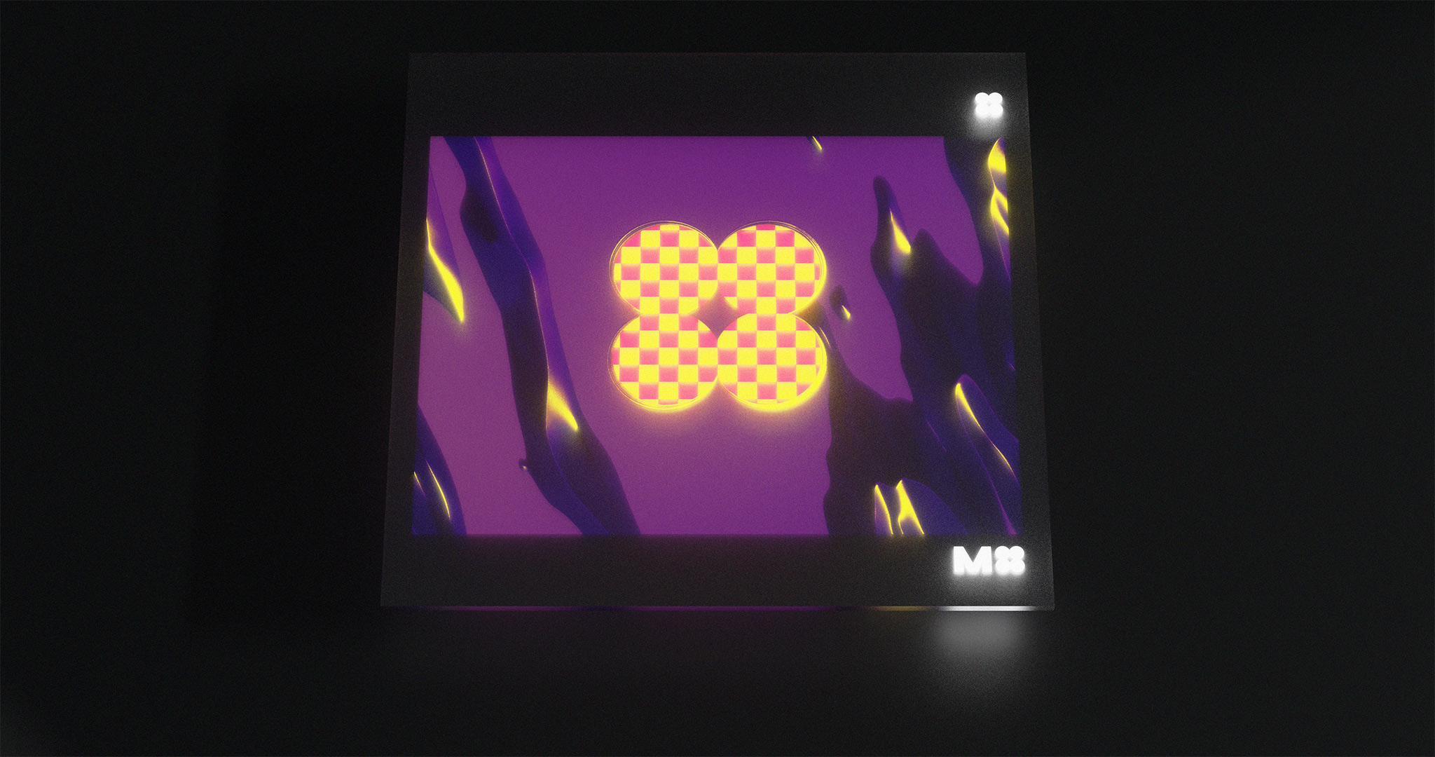
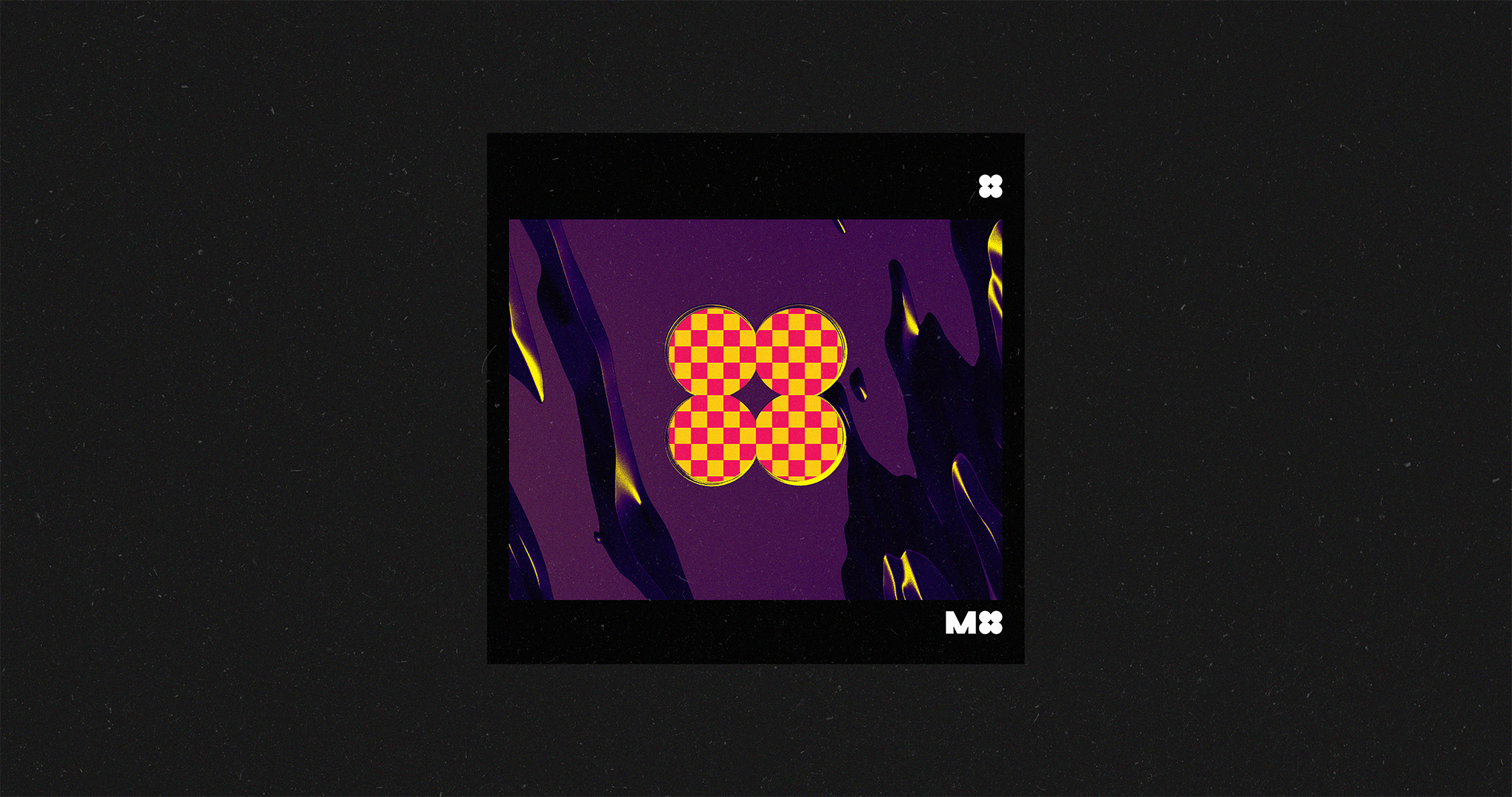
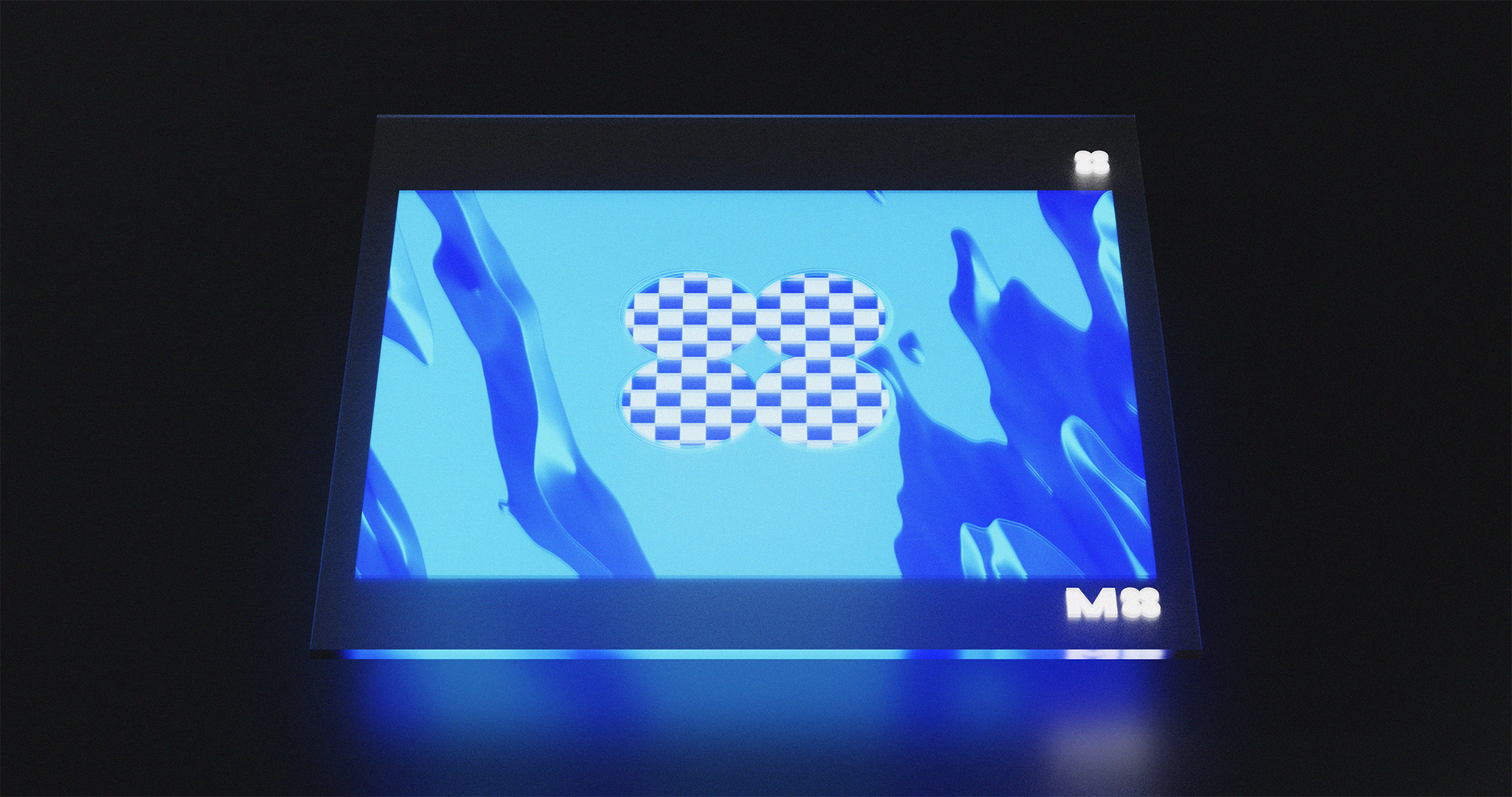
Here’s what we had in the end:
